Essential Prompt Engineering Vocabulary (2025)
Master the key words and phrases that make AI prompts more effective. A practical reference for data analysis, design, and coding.
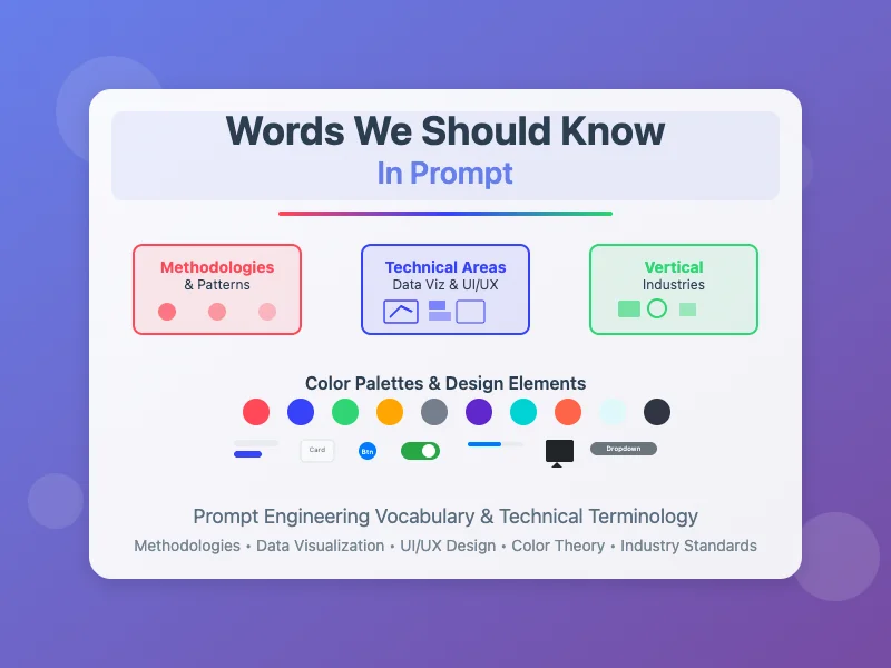
Words We Should Know In Prompt (Keep Updating)
TL;DR: This continuously updated reference collects the most important vocabulary, phrases, and templates for prompt engineering. It covers foundational techniques (few-shot prompting, role-playing, prompt chaining), structured output formats, domain-specific terminology for data visualization and UI/UX design, and vertical industry terms. Use it as a cheat sheet when crafting prompts for ChatGPT, Claude, Amazon Bedrock, or any large language model.
Writing effective AI prompts requires the right vocabulary. This continuously updated reference collects the most important words, phrases, and templates you need for prompt engineering across common domains -- from foundational techniques like few-shot prompting and role-playing, to specialized terminology for data visualization, UI/UX design, and vertical industries. Use this guide as a quick-reference cheat sheet when crafting prompts for ChatGPT, Claude, Amazon Bedrock, or any large language model.
Key Takeaways
- Clarity, specificity, and context are the foundational principles -- vague prompts produce vague results, while structured prompts with constraints consistently outperform.
- Few-shot prompting (providing examples in the prompt) and role-playing (assigning a persona) are two of the most effective techniques for steering LLM output quality.
- Structured output formats -- explicitly requesting JSON, tables, numbered lists, or specific word counts -- give you predictable, usable results.
- Domain-specific vocabulary matters: using the correct chart type name (e.g., "treemap" vs. "nested chart") or UI component term (e.g., "meatballs menu," "breadcrumb") dramatically improves AI-generated outputs.
- Meta-prompting and prompt optimization tools can automatically transform vague initial prompts into high-quality, production-ready instructions.
- Prompt chaining -- breaking complex tasks into sequential steps -- is essential for multi-step workflows that exceed a single prompt's capacity.
As capability of models keep evolving, one core value from human perspective is how to raise your requirement in concise, accurate and specific manner, shifting our mindset from doing by myself to instructing model to attain the desired output. Take MCP server implementation as an example, the built-in prompt to guide the model to fully understand per tools' capabilities and limitations and process to integrate them into whole workflow to accomplish user task, is a key factor to determine the quality of the MCP server implementation.
Check the following prompt snippet in Amazon Nova Canvas MCP server, which is a tool to generate images using Amazon Nova Canvas, this is typical structured API like description in perspective of engineering perspective:
This article lists a collection of words or templates that we could use in prompt to guide the LLM to generate the desired output, categorized by the methodologies & patterns, common technical areas e.g. data visualization, and vertical industries, e.g. A-roll in Media & Entertainment Industry. The words are not exhaustive, but they are the most common words that we could use in prompt.
Methodologies & Patterns
Foundational Principles
- Clarity, Specificity, and Contextual Framing:
Prompts must be unambiguous, utilizing straightforward language, and providing sufficient background information to guide the LLM effectively. Vague or overly general inputs invariably lead to inconsistent or irrelevant outputs.
Sample Prompts:
- Structured Output Formats and Constraints:
Explicitly defining the desired structure, tone, and length of the LLM's response is crucial. This can involve specifying output formats such as JSON, bullet points, numbered lists, tables, or adhering to specific word or sentence counts.
Sample Prompts:
- Few-Shot Prompting (Optional):
Providing one or more labeled examples (demonstrations) directly within the prompt guides the model towards desired patterns, formats, or reasoning approaches, when there are not enough direct samples can be fetched from the web URL (e.g. llms.txt) or list API built within MCP server.
Sample Prompts:
- Role-Playing and Persona Assignment:
Assigning a specific role or persona to the LLM, for instance, "You are an experienced customer success manager", guides its overall style, output content depth and tone.
Sample Prompts:
- Managing Prompt Length and Complexity:
While providing necessary details, prompts should be concise to avoid overloading the model. For complex, multi-step tasks, it is highly effective to break them down into smaller, logical, sequential parts, often using a technique known as prompt chaining.
Sample Prompts:
- Retrieve external context from knowledge base, MCP server, or web URL:
Explicitly instruct the LLM to retrieve more context before generating the output, mitigate the risk of hallucination and outdated information.
Sample Prompts:
- Automated Prompt Optimization: Meta-Prompting
Use tools like (Prompt Optmize)[https://docs.aws.amazon.com/bedrock/latest/userguide/prompt-management-optimize.html], (PromtPilot)[https://promptpilot.volcengine.com/] to optimize the prompt, or tried the (Prompt Genertor)[https://github.com/aws-samples/claude-prompt-generator] we wrote.
The workflow would be like:
- Initial "Lazy" Prompt (Input to Optimizer): "Tell me about cloud deployment."
- Automated Prompt Optimizer Output (Optimized Prompt): "As an AWS DevOps Specialist, provide a concise overview of the key considerations for deploying a highly scalable web application on AWS. Focus on compute services (e.g., EC2, Lambda, Fargate), database options (e.g., RDS, DynamoDB), and networking (e.g., VPC, Load Balancers). Present the information as a bulleted list, with each point including a brief explanation and its impact on application architecture."
- Modify the optimized prompt to fit your own context and requirement, then iterate again.
Common Technical Areas
Data Visualization
Refer to the diagram and its mapping description with the following words below:
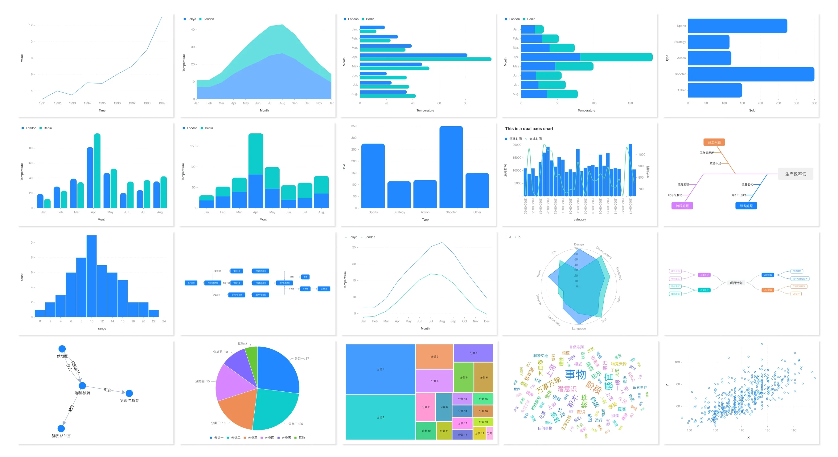
Row 1:
- Line Chart (Simple Trend)
Usage: Basic line chart displaying the evolution or trend of a single data series over a continuous dimension, likely time, emphasizing progression.
- Area Chart (Stacked Multi-Series)
Usage: Shows two or more data series plotted as areas, stacked on top of each other. This effectively illustrates the contribution of each series to the total over time or another continuous dimension, highlighting both individual and cumulative trends.
- Horizontal Stacked Bar Chart, all sub-components per index are displayed are separately
Usage: Each horizontal bar represents a category, and it's divided into colored segments that show the breakdown of that category into sub-components. This chart is excellent for comparing the proportions of different parts across multiple categories.
- Horizontal Stacked Bar Chart, all sub-components per index are combined into one bar
Usage: Each horizontal bar represents a category, and all sub-components are displayed per index are combined into one bar, this also uses stacked horizontal bars to display the composition of categories, allowing for direct comparison of how different elements contribute to a whole in various contexts.
- Horizontal Bar Chart, single series comparison
Usage: Each horizontal bar represents a category, simple comparison of different categories with no sub-components.
Row 2:
- Vertical Bar Chart, all sub-components per index are displayed separately
Usage: Also known as a Column Chart, this displays individual data values for distinct categories using vertical bars. It's commonly used for comparing quantities across different items or over discrete periods.
- Vertical Stacked Bar Chart, all sub-components per index are combined into one bar
Usage: Each vertical bar represents a category, and it's segmented into colored sections to illustrate the contribution of various sub-components. This chart is useful for comparing both the total value and the internal proportions across different categories.
- Vertical Bar Chart, single series comparison
Usage: Also known as a Column Chart, simply displays individual values for distinct categories, suitable for direct comparisons of quantities.
- Dot-Line Chart (Time Series with Markers)
Usage: A time series chart that combines a line connecting data points with distinct markers (dots) at each point. This emphasizes individual data observations while still showing the overall trend over time.
- Flowchart / Process Flow Diagram (Curved/Diagonal Connectors)
Usage: Illustrates a sequence of steps, decisions, or processes using interconnected nodes (shapes with text) and curved lines with arrows, indicating direction and relationships within a system.
Row 3:
- Histogram
Usage: A specific type of vertical bar chart used to display the distribution of continuous numerical data. The bars represent ranges (bins), and their height indicates the frequency or count of data points falling within each range, useful for visualizing data concentration and spread.
- Flowchart / Process Flow Diagram (Straight Connectors)
Usage: Illustrates a process or system using interconnected nodes and straight lines with arrows to show logical flow.
- Line Chart (Smoothed Trend)
Usage: A line chart where the line connecting data points is smoothed or interpolated, rather than showing sharp angles. This technique is often used to emphasize the general trend or pattern in data over time, reducing visual noise from individual fluctuations.
- Radar Chart / Spider Chart
Usage: A multi-axis chart used to display multivariate data in the form of a two-dimensional chart of three or more quantitative variables represented on axes starting from the same point. It's excellent for comparing the performance or characteristics of a single entity across multiple dimensions, or for comparing multiple entities across the same dimensions.
- Mind Map / Concept Map
Usage: A hierarchical diagram that visually organizes information around a central concept. It typically uses nodes (often with keywords or short phrases) connected by lines, representing relationships and associations to aid in brainstorming, structuring ideas, or note-taking.
Row 4:
- Network Diagram / Node-Link Diagram
Usage: A graph-based visualization that represents entities (nodes) as points and relationships (links) as lines connecting them. It's used to show connections, interactions, and structures within a network.
- Pie Chart
Usage: A circular statistical graphic divided into slices to illustrate numerical proportion. Each slice represents a category's percentage of the whole, making it easy to see relative contributions.
- Treemap
Usage: Displays hierarchical data as a set of nested rectangles. Each rectangle's area is proportional to a specific value, and the rectangles are colored to show categories. It's effective for visualizing large datasets and showing proportions within a hierarchy.
- Word Cloud / Tag Cloud
Usage: A visual representation of text data, where the size of each word indicates its frequency or importance within a given text or dataset. It highlights prominent terms.
- Scatter Plot
Usage: A graph that displays values for typically cluster of variables for a set of data. Each data point is represented by a dot, and the pattern of the dots reveals the relationship or correlation between the variables.
UI/UX Design
Basic Web Elements
- Meatballs Menu (Three Dots Menu)
Usage: A compact menu trigger consisting of three vertical or horizontal dots that reveals additional actions or options when clicked. Commonly used in cards, tables, or toolbars to save space while providing access to secondary actions like edit, delete, share, or more options.

- Accordion
Usage: A vertically stacked list of collapsible sections that expand or collapse to reveal content when clicked. Each section has a header that acts as a control for the toggle functionality. Ideal for organizing large amounts of content in a compact, scannable format such as FAQs, documentation, or settings panels.

- Breadcrumb
Usage: A secondary navigation aid that shows the user's location within a website hierarchy and provides links to parent pages. Typically appears as a horizontal trail of linked page names separated by arrows or chevrons, helping users understand their current position and navigate back to previous levels.

- Card
Usage: A flexible content container that groups related information and actions in a visually distinct, rectangular module. Cards typically include an image, title, description, and action buttons. Perfect for displaying items in grids, product listings, blog previews, or dashboard widgets.

- Modal/Dialog
Usage: An overlay window that appears on top of the main content, requiring user interaction before returning to the main interface. Contains a backdrop that dims the underlying content, a close button, and typically includes headers, body content, and action buttons. Used for confirmations, forms, alerts, or detailed views.

- Dropdown
Usage: A toggleable menu that displays a list of options when activated, typically triggered by clicking a button or input field. The list appears below or above the trigger element and can contain links, actions, or selectable options. Essential for navigation menus, form selects, and filter controls.

- Tabs
Usage: A navigation pattern that organizes content into multiple panels, with only one panel visible at a time. Tab headers are typically arranged horizontally and clicking a tab reveals its associated content panel. Effective for organizing related content sections like settings categories, data views, or form steps.

- Toggle/Switch
Usage: A binary input control that allows users to switch between two states (on/off, enabled/disabled). Typically represented as a sliding switch or checkbox-style toggle. Commonly used for settings, feature activation, or any boolean preference where the current state needs to be clearly visible.

- Carousel/Slider
Usage: A rotating display of content items (images, cards, or panels) where users can navigate through multiple items using previous/next controls or indicators. Often includes automatic rotation and pagination dots. Perfect for showcasing featured content, product galleries, or testimonials.

- Sidebar
Usage: A vertical navigation panel typically positioned on the left or right side of the main content area. Contains primary navigation links, secondary actions, or contextual information. Can be collapsible or fixed, and often includes hierarchical menu items for complex applications.

- Navigation Bar
Usage: A horizontal navigation component typically placed at the top of a website or application. Contains the brand/logo, primary navigation links, and often includes user account controls or search functionality. Serves as the main wayfinding element and remains consistent across pages.

- Footer
Usage: A page section positioned at the bottom of content that contains secondary information such as copyright notices, additional navigation links, contact information, social media links, and legal pages. Provides closure to the page and houses less critical but necessary information.

- Hero Section
Usage: A prominent banner area typically placed at the top of a landing page, featuring large typography, compelling imagery or video background, and primary call-to-action buttons. Designed to immediately capture attention and communicate the main value proposition or key message.

- Badge/Chip
Usage: Small labeled indicators used to highlight important information, categorize content, or show status. Badges can display numbers (like notification counts) or text labels (like status indicators). Chips are similar but often removable and used for tags, filters, or selected items.
- Progress Bar
Usage: Visual indicator showing the completion status of a task or process. Can be linear (horizontal bar) or circular, with filled portions representing progress. Often includes percentage text and can show stepped progress for multi-stage processes. Essential for file uploads, form completion, or loading states.

- Tooltip
Usage: Small contextual popover that appears when hovering over or focusing on an element, providing additional information or clarification. Typically contains brief explanatory text and includes a small arrow pointing to the trigger element. Helps improve usability without cluttering the interface.

- Pagination
Usage: Navigation component that divides large datasets or content across multiple pages, showing numbered page links with previous/next controls. Helps manage large amounts of content by breaking it into digestible chunks and provides clear navigation between pages.

- Search Bar
Usage: Input field specifically designed for search functionality, typically including a search icon and placeholder text. May include features like autocomplete, search suggestions, or filters. Can be positioned in headers, sidebars, or as a prominent page element depending on the application's search needs.

- Button (Call-to-Action)
Usage: Interactive elements that trigger actions when clicked, available in various styles (primary, secondary, danger, success) to indicate importance and function. CTAs are specifically designed to prompt user actions like "Sign Up," "Buy Now," or "Learn More," using compelling colors and positioning.

- Form Input
Usage: Collection of interactive elements for user data entry including text fields, password fields, checkboxes, radio buttons, and select dropdowns. Each input type serves specific data collection needs and includes proper labeling, validation states, and accessibility features for optimal user experience.

Color Palette Combinations
- Red to Purple Warm Gradient
Usage: Perfect for creative portfolios, personal branding, and individuality-focused websites. This warm transition evokes passion, creativity, and personal expression. Ideal for artists, designers, creative agencies, and lifestyle brands that want to convey energy and artistic flair.

- Blue to Teal Cool Gradient
Usage: Excellent for technology companies, healthcare applications, and professional services. This cool palette suggests trust, stability, and innovation. Perfect for fintech, healthcare platforms, corporate websites, and tech startups that need to convey reliability and expertise.

- Monochromatic Grayscale
Usage: Ideal for minimalist designs, photography portfolios, and luxury brands. This sophisticated palette emphasizes content over color, creating elegant and timeless designs. Perfect for architectural firms, high-end fashion, photography studios, and premium product showcases.

- Earthy Natural Tones
Usage: Perfect for organic brands, eco-friendly companies, and wellness-focused businesses. This warm, natural palette suggests sustainability, authenticity, and connection to nature. Ideal for organic food brands, wellness centers, outdoor gear companies, and sustainable fashion.

- Sunset Golden Palette
Usage: Excellent for travel, hospitality, and lifestyle brands. This vibrant, warm palette evokes adventure, optimism, and memorable experiences. Perfect for travel agencies, hotels, restaurants, event planning, and lifestyle blogs that want to inspire and energize.

- Ocean Depths Gradient
Usage: Ideal for marine-related businesses, meditation apps, and calming wellness platforms. This deep blue palette suggests depth, tranquility, and vast possibilities. Perfect for marine research, diving centers, spa services, mindfulness apps, and water-related sports.

- Vibrant Neon Palette
Usage: Perfect for gaming, entertainment, and youth-focused brands. This high-energy palette suggests excitement, innovation, and cutting-edge technology. Ideal for gaming companies, nightlife venues, tech events, music festivals, and brands targeting Gen Z audiences.

- Forest Greens Gradient
Usage: Excellent for environmental organizations, outdoor recreation, and growth-focused businesses. This natural palette suggests growth, harmony, and environmental consciousness. Perfect for environmental NGOs, outdoor equipment, gardening services, and sustainable technology companies.

- Pastel Spring Palette
Usage: Ideal for baby/children products, beauty brands, and soft lifestyle applications. This gentle palette suggests tenderness, youth, and approachability. Perfect for baby care products, beauty salons, children's education, wedding services, and gentle wellness brands.

- Midnight Dark Palette
Usage: Perfect for luxury brands, premium technology, and sophisticated professional services. This dark, elegant palette suggests exclusivity, power, and premium quality. Ideal for luxury automotive, high-end electronics, premium consulting, and exclusive membership platforms.

Vertical Industries
Media & Entertainment Industry
Frequently Asked Questions
What are the most important prompt engineering terms?
The most important prompt engineering terms include: few-shot prompting (providing labeled examples in the prompt to guide output format and quality), role-playing/persona assignment (instructing the AI to adopt a specific expert role), prompt chaining (breaking complex tasks into sequential steps), structured output formats (requesting JSON, tables, or numbered lists), meta-prompting (using AI to optimize prompts themselves), and contextual framing (providing sufficient background and constraints). Understanding these core techniques allows you to dramatically improve the quality, consistency, and usefulness of AI-generated outputs across any domain.
How to write better AI prompts?
Writing better AI prompts follows six key principles: (1) Be specific and unambiguous -- replace "Tell me about AWS" with "Summarize the serverless web application frameworks available on AWS, focusing on their suitability for high-traffic APIs." (2) Use structured output constraints -- specify format (JSON, bullet points, tables), word count, and tone. (3) Provide examples using few-shot prompting when the desired output pattern is not obvious. (4) Assign a role or persona to set the expertise level and perspective. (5) Retrieve external context from knowledge bases, MCP servers, or documentation URLs to reduce hallucination. (6) Use prompt chaining for complex multi-step tasks rather than cramming everything into one prompt.
What vocabulary improves AI prompt results?
Domain-specific vocabulary significantly improves AI prompt results. For data visualization, use precise chart type names like "treemap," "radar chart," "scatter plot," or "horizontal stacked bar chart" instead of vague descriptions. For UI/UX design, use component-specific terms like "meatballs menu" (three-dot menu), "breadcrumb navigation," "hero section," "accordion," "modal dialog," or "carousel." For color design, reference specific palette types like "monochromatic grayscale," "complementary colors," or "analogous palette." For coding tasks, specify frameworks, patterns, and conventions by name. The more precise your vocabulary, the more accurate and usable the AI output becomes.
Subscribe to the newsletter
About the Author
Aaron is an engineering leader, software architect, and founder with 18 years building distributed systems and cloud infrastructure. Now focused on LLM-powered platforms, agent orchestration, and production AI. He shares hands-on technical guides and framework comparisons at fp8.co.
Cite this Article
Related Articles
The Evolving Landscape of Generative AI
Foundation Models, Agents, Data Value, and MCP Architecture in the Modern AI Ecosystem
Generative AI, Foundation Models, AgentsUI/UX Quality Checklist: 50+ Measurable Criteria
Master UI/UX quality with this 50-point checklist. Covers usability, WCAG accessibility, and engineering standards for any web interface.
Design, Prompt