UI/UX Quality Checklist: 50+ Measurable Criteria
Master UI/UX quality with this 50-point checklist. Covers usability, WCAG accessibility, and engineering standards for any web interface.
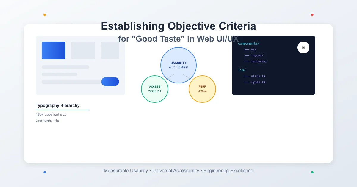
Establishing Objective Criteria for "Good Taste" in Web UI/UX
TL;DR: "Good taste" in web UI/UX is not subjective -- it can be measured through concrete criteria across four dimensions: usability metrics, WCAG accessibility compliance, business workflow efficiency, and engineering best practices. This checklist provides an objective evaluation framework for auditing interfaces, guiding new designs, or providing structured context to AI-assisted design tools like Claude, Cursor, or Amazon Q.
1. Preface
What separates a well-designed web interface from a mediocre one, and how can you measure the difference objectively? This checklist defines concrete, measurable criteria for evaluating web UI/UX quality across four dimensions: usability, accessibility, business workflow efficiency, and engineering best practices (with a focus on Next.js and React). Use it as an evaluation framework for auditing existing interfaces, guiding new designs, or providing structured context to AI-assisted design tools.
Key Takeaways
- "Good taste" in UI/UX is measurable -- it is grounded in usability metrics, accessibility compliance (WCAG contrast ratios), workflow efficiency, and engineering quality rather than subjective preference.
- User-centered design starts with understanding needs and pain points, not personal aesthetic choices -- context awareness across mobile, desktop, and web is essential.
- Business workflow optimization requires progressive disclosure, real-time validation, and iterative improvement based on objective KPIs like latency and task completion rates.
- Visual hierarchy, grid systems, and consistent component libraries are the structural foundations that make interfaces intuitive and scannable.
- Next.js App Router conventions (colocation, route groups, server/client component separation) provide an engineering framework that directly supports UI/UX quality.
- This checklist works as AI prompt context -- feed it to Claude, Cursor, or Amazon Q when prototyping, auditing, or evaluating web interfaces for objective quality assessment.
"Good taste" in web UI/UX design extends far beyond subjective aesthetic preferences. It is fundamentally rooted in measurable usability, universal accessibility, efficient business workflows, and robust, maintainable engineering practices.
This report delineates objective criteria that can serve as a foundational baseline for both human evaluation and potential AI-driven quality assessment. By adhering to these principles, organizations can consistently deliver digital products that are not only visually appealing but also highly functional, intuitive, and sustainable in the long term.
The integration of product-centric user experience with engineering best practices, particularly within a Next.js framework, is paramount to achieving this holistic standard of excellence.
2. Product Perspective
2.1 User-Centric Design Philosophy
User-Centered Focus
- Prioritize the user's perspective by understanding their needs, pain points, preferences, and opinions in early stage of product design, instead of personal design preferences
Usability
- Ensure the product is easy and safe to use, avoid cluttered or confusing interfaces, regardless of aesthetic appeal
Context Awareness
- Understand the environment and conditions in which users interact with the product (Mobile/PC/Web, motivation/scenarios), offer intuitive guidance and instructions at the beginning or during the user journey
2.2 Streamlined Business Workflow
Existing Workflow Analysis
- Visualize existing workflows with flowcharts before starting, try to identify the tedious and error-prone tasks (e.g., rule based data ETL, web crawling, templated document)
Task‑First Flows
- Every user journey maps to a clear business goal (e.g. "Create invoice," "Approve request," "Track shipment")
- Eliminate unnecessary steps, minimize clicks and page loads
- Use progressive disclosure: show only essential options, reveal advanced settings on demand
Contextual Onboarding & Guidance
- Show brief tooltips or coach marks only the first time a user encounters a new pattern
- Provide inline help ("?" icons, microcopy) adjacent to complex fields
- Offer a persistent "?" or "?" panel that can be toggled without leaving the flow
Error Prevention & Recovery
- Validate inputs in real time (e.g. email format, required fields) before submission
- Show clear, actionable error messages: "The ZIP code must be 5 digits" rather than "Invalid input"
- Provide undo or "Are you sure?" for destructive actions
Iterative on objective metrics
- Continuously monitor KPIs (latency, accuracy, recall etc.) to refine workflows follow DevOps pipeline
2.3 Interactive and Guidative User Experience
2.3.1 Interaction Patterns
Form Patterns to streamline user input, include:
- Progressive Disclosure: Initially displays only essential form fields, revealing additional fields as needed to prevent information overload
- Inline Validation: Provides immediate feedback on form field inputs, reducing errors and user frustration
- Auto-Complete: Suggests potential inputs as the user types, speeding up form completion and reducing cognitive effort
Content Patterns to optimize content display and access, include:
- Cards: Organizes content into visually distinct blocks, providing a clear and organized layout
- Infinite Scroll: Continuously loads content as the user scrolls, eliminating the need for pagination and providing a seamless browsing experience
- Modal Windows: Displays important information or actions in a pop-up window, requiring user interaction for critical alerts or focused tasks
2.3.2 Effective Onboarding
Simplified Signup Process: Collecting only the most critical information to save time and reduce drop-off rates. Approaches like deferred account creation allow users to engage with the product before committing to an account, lowering initial barriers.
Contextual Guidance: Instead of overwhelming mandatory tutorials, guidance should be provided precisely when and where users need it. Effective empty states, include helpful messages and clear CTA (calls-to-action), are vital to prevent users from feeling lost or abandoned.
Onboarding Checklists: Maintain user focus by providing 4-5 clear, manageable steps. Incorporating completed actions into the checklist creates a sense of progress, motivating continued engagement and improving retention.
Interactive Tutorials and Progressive Onboarding: Interactive tutorials guide new users through features with animations and interactive elements, preventing information overload and allowing users to learn at their own pace.
2.3.3 Feedback and Error Handling
Visual Feedback: Uses cues like color changes, animations, and typography (e.g., button hover effects, loading animations, success messages).
Auditory Feedback: Employs sound effects and voice messages (e.g., notification sounds).
Immediate and Clear Visibility: Errors should be instantly noticeable, highlighting the specific field with clear visual markers like red color and exclamation marks.
Simple and Helpful Explanations: Use plain language to explain the error (e.g., "Invalid username or password" instead of jargons) and provide constructive guidance including navigation options or step-by-step solutions.
2.4 Aesthetic and Layout Harmony
2.4.1 Fundamental
Colors are categorized into primary (red, blue, yellow), secondary (orange, purple, green, formed by mixing two primaries), and tertiary (mixing a primary and a secondary). Define a primary, secondary, and neutral palette (light/dark shades), and be aware of the color temperature: Warm colors (yellow, red) evoke energy; cool colors (blue, green, purple) suggest calmness; neutral colors (brown, gray, black, white) provide balance and defer attention to content. Use no more than 3 accent colors for calls‑to‑action or alerts, and maintain contrast ratio ≥4.5:1 for text over background.
Harmony and psychology
Color harmony refers to visually pleasing color combinations that engage the viewer and establish a sense of order. A lack of harmony can make an interface appear boring or chaotic. Palettes can promote contrast (e.g., complementary colors like red and green) or consonance (e.g., analogous colors next to each other on the color wheel).
Color psychology explores how colors influence human mood and behavior. For example, orange is energetic, red is associated with energy or passion, and yellow evokes positivity. Understanding these associations is crucial for attracting the target audience and conveying brand identity.
Convention
Include using dark colors for text to ensure legibility, keeping light colors for backgrounds, and using contrasting colors for accents (e.g., call-to-action buttons). It is critical to ensure sufficient color contrast for accessibility, with WCAG recommending a minimum ratio of 4.5:1 for most text and 3:1 for large, bolded text.
2.4.2 Typography Best Practices
Readability and Compatibility
- Font Choice: Sans-serif fonts are generally more readable in digital contexts for body text, as they lack the ornamental projections of serif fonts that can make web text harder to follow. Serif fonts can be effectively used for titles, headings, or decorative sections for contrast.
- Compatible Typefaces: When using multiple typefaces, select options that are visually compatible yet distinguishable.
- Standard Fonts: Sticking to web-safe, standard fonts ensures text renders correctly across all browsers and devices, enhancing readability and minimizing distraction. For non-standard fonts, implementing a font stack (a list of backup fonts) in CSS ensures suitable text is always displayed.
Sizing and Spacing
- Appropriate Sizing: A minimum font size of 16px is a common practice for website text, as it is the smallest size most people can read without zooming. Headings should be larger than body text and decrease hierarchically (H1, H2, H3) to aid scanning and comprehension.
- Line Length: Lines of text should ideally be between 40 and 80 characters for comfortable reading, with 60-70 characters per line being a recommended sweet spot.
- Line Spacing (Leading): Sufficient spacing between lines ensures readers can easily follow text and return to the next line. A spacing of 1.5 for body text and 2.5 between paragraphs is a good starting point.
Avoiding Distractions
- All Caps: Avoid using all caps for body text, as it significantly hinders readability. Bolding text is a more effective and readable alternative for emphasis.
- Text Animations: Flashing or moving text should be eliminated as it impedes readability, can be perceived as a gimmick, and may even trigger photosensitive seizures.
2.4.3 Element Layout Principles
Simplicity and Visual Hierarchy
"Less is more" advocates for a minimalistic approach in UI/UX design. This involves focusing on essential elements and providing easy-to-follow navigation to help users achieve their goals without confusion. A clean design prioritizes ample white space, straightforward layouts, and limited color schemes to reduce visual clutter and enhance user focus. Effective visual hierarchy guides the user's attention to key sections and actions in a natural and intuitive manner. By strategically placing and sizing elements (e.g., larger fonts for headings, bold colors for call-to-action buttons), designers can direct focus to critical information, improving the overall user journey.
Consistency in UI Elements
Implementing uniform UI components and repeating them by reusing spacing, typography, and color tokens across pages and maintain a shared component library for buttons, inputs, modals, etc:
- Visual Consistency: Fonts, buttons, colors, and images should be consistent across the product.
- Functional Consistency: Similar controls and functions should behave identically to maintain predictability and intuitive navigation, e.g. a "Download" button should always initiate a download.
- Navigation Tools: Clear, consistent navigation from page to page, users expect a sticky header, a search bar at the top, organized drop-down menus, and a log-in button.
Grid Systems
Grid systems provide an underlying structure of columns and rows that organizes elements consistently, ensure clear hierarchy, ease of navigation, and aesthetic appeal, acting as the "skeleton of a website". Different types of grids exist, such as column grids (vertical divisions), hierarchical grids (emphasizing elements by importance), manuscript grids (for text-heavy content), baseline grids (horizontal lines for consistent text spacing), and modular grids (square/rectangular content blocks). Align related elements flush‑left or center‑aligned within cards, keep form fields, labels, and icons on consistent vertical rhythm.
The choice of grid depends on the website's purpose; a 12-column grid with consistent margins (e.g. 24px outer, 16px inner) might suit a simple blog, while complex e-commerce sites may need more dynamic systems. Use percentages to distribute content uniformly, adapting layouts dynamically without distorting content or dimensions.
Componentization & Modularity
- Break the UI and logic into reusable, well-isolated components.
- Each component should:
- Have clear input/output props
- Manage only its own internal state (if necessary)
- Avoid tight coupling to other components unless explicitly designed to be composed together
- Follow "single responsibility principle" – one component = one purpose
- Place reusable utility functions (e.g., formatting, calculations) in separate helper files
Code Style & Consistency
Match industry-standard best practices or the following conventions:
- Naming conventions: PascalCase for components, camelCase for variables/functions
- Use consistent import ordering, and group third-party, project-level, and relative imports
- Stick to Prettier formatting rules (2-space indent, semicolons, quotes, trailing commas, etc.)
- Follow ESLint rules and TypeScript strict types
2.4.4 Accessibility Integration
Accessibility ensures that all users, including those with disabilities, can use the product with ease. This is not merely a compliance requirement but a commitment to inclusive design from the beginning. Key elements of accessibility include:
- Text Readability and Contrast: Sufficient color contrast for text and images of text (WCAG 1.4.3).
- Clear Information and Navigation: Logical heading structures, descriptive link text (avoiding "click here"), and clear focus indicators for keyboard navigation.
- Non-Text Content: Providing alt text for all images and graphics.
- Error Correction: Designing ways to alert users to input mistakes and providing clear instructions for correction.
- Sensory Considerations: Avoiding reliance solely on color, shape, size, or sound to convey information, and providing controls for moving or flashing content.
3. Engineering Perspective (Next.js Specific)
3.1 Optimized Folder & File Hierarchy
3.1.1 Next.js App Router Structure
The app directory in Next.js 13+ defines the route structure, where each folder represents a URL segment, and App Router within app directory compare to legacy Pages Router within pages is recommended as it represent future framework direction with more advanced feature e.g. shared layout, nested routing, loading states and error handling. The src directory is an optional but recommended choice for housing application source code, offering clear separation from configuration files and consistency with other JavaScript/TypeScript projects. The public directory is designated for static assets e.g. thumbnail images.
Refer to sample folder hierarchy below following simple rule below:
- Group by feature (colocation) rather than technical type only.
- Next.js conventions: use `page.tsx` and `layout.tsx` in each folder to auto‑generate routes.
- Avoid deeply nested paths—max 3 levels under `/app` to reduce path complexity.
- Tailwind: define all colors, spacing, and typography in `tailwind.config.ts` to define theme of colors primary, keyframes, animation, etc.
Sample file hierarchy shown below:
3.1.2 Component Organization
Components should be organized logically to promote reusability and maintainability, categorize them as:
- ui components: Basic, reusable building blocks (e.g., Button, Card, Modal) that are not tied to specific business logic.
- layout components: Larger structural elements of the application (e.g., Header, Footer, Sidebar).
- features components: Components linked to specific business features or domains (e.g., LoginForm within an auth feature folder).
Co-locating related files (e.g., component, its tests, and its styles) within the same folder simplifies code management and prevents the root components folder from becoming overcrowded. Using index.ts files to export multiple components or utilities from a folder can also flatten import paths and improve organization.
3.1.3 Utility and Library Management
Dividing between utils and lib directories enhances clarity:
- utils directory: Contains pure utility functions that have no side effects, do not depend on external services, and are easily testable in isolation (e.g., date formatting, string manipulation, calculation helpers).
- lib directory: Houses more complex functionalities that often interface with external services, contain business logic, or manage state/side effects (e.g., API client configurations, authentication helpers, database connections).
3.1.4 Naming Conventions and Flat Structure
Consistent naming conventions are essential for code readability and maintainability.
- PascalCase: For component names (e.g., UserProfile, Button.js).
- camelCase: For function names and variables (e.g., handleSubmit).
- SCREAMING_SNAKE_CASE: For constants, enumeration properties, and global variables.
Avoiding deep nesting of folders is also crucial; if many levels of subfolders emerge, restructuring should be considered to keep the project flat and manageable.
3.1.5 Route Groups and Private Folders
Next.js provides features for advanced folder organization:
- Route Groups: Wrapping a folder name in parentheses `(folderName)` in the app directory indicates that the folder should not be included in the route's URL path. This is useful for organizational purposes, allowing related routes (e.g., `(dashboard)/profile`, `(dashboard)/billing`) to be grouped without affecting the URL structure.
- Private Folders: Prefixing a folder name with an underscore `_folderName` marks it as a private folder, opting it and its sub-folders out of routing. This is beneficial for cleanly separating UI logic from routing logic or organizing internal library code.
3.2 Componentized & Centralized CSS
Global CSS
For styles that need to be applied across the entire application, Next.js supports global CSS. A global.css file can be created and imported into the root layout (app/layout.js or app/layout.tsx) to ensure styles extend to every route.
Tailwind CSS
Use Tailwind for its vast set of pre-built utility classes that can be applied directly in HTML/JSX, offering complete control over customization while removing default styling and its support of dynamic theming, where configurations can be injected from a CMS for real-time style updates without redeployment.
3.3 Concise & Maintainable Code (React/Next.js)
3.3.1 Common rules
- Break down large pages into small, focused components (max ~200 lines).
- Use props interfaces to enforce required vs. optional data.
- All component props typed with TypeScript.
- Use Return Types on data‑fetching functions (e.g. `fetchInvoices(): Promise
- Use Next.js Image component (`
`) for optimized loading. - Leverage dynamic imports (`next/dynamic`) for heavy components below the fold.
3.3.2 Hooks
Modern React development strongly favors functional components coupled with Hooks over class components. Hooks simplify state management, enhance performance, and improve code reusability by allowing stateful logic to be extracted into reusable functions. Strict adherence to the "Rules of Hooks" is crucial:
- Only call Hooks at the top level: Hooks must not be called inside loops, conditions, or nested functions to ensure they are called in the same order each time a component renders, which allows React to correctly preserve their state.
- Only call Hooks from React functions: Hooks should only be called from React function components or custom Hooks, not from regular JavaScript functions.
3.3.3 Separation between Server-side and Client-side
Server components should handle data fetching, passing only the necessary data to client components for UI rendering. This separation reduces JavaScript bundle size, speeds up client-server communication, and enhances security by ensuring sensitive database operations and credentials remain strictly on the server. The server-only directive can be used to explicitly prevent server-side code from being imported into client components, further safeguarding sensitive information. Extracting state business logic away from UI components into dedicated custom hooks also improves reusability and testability.
3.3.4 State management
- Local State: For state relevant only to a single component, `useState` should be used to keep it local, limiting its scope and simplifying debugging.
- Global State: When multiple components require access to the same state, React Context or dedicated state management libraries should be considered to avoid "prop drilling" (passing props through many layers), which decouples components and improves maintainability.
4. How to use the guidance
Add the whole or select partial of the contents as the initial prompt or referred as external context in Amazon Q/Claude/Cursor/Cline when:
- Prototyping your UI/UX from scratch: Use this guidance as a foundational reference to ensure your design decisions are based on objective criteria rather than subjective preferences.
- Revise your existing UI/UX application: Apply these principles to audit and improve your current interfaces, focusing on measurable improvements in usability, accessibility, and maintainability.
- Team alignment and standards: Use this document to establish consistent design and development standards across your organization, ensuring everyone works towards the same definition of "good taste" in web interfaces.
- AI-assisted design evaluation: Leverage these criteria as prompts for AI tools to help evaluate and suggest improvements to your UI/UX designs based on objective, measurable standards.
Frequently Asked Questions
What makes good UI/UX design?
Good UI/UX design is grounded in measurable criteria rather than subjective preference. It combines user-centered usability (easy navigation, clear feedback, minimal cognitive load), universal accessibility (WCAG contrast ratios of 4.5:1 or higher, keyboard navigation, alt text for images), efficient business workflows (progressive disclosure, real-time validation, minimal clicks to complete tasks), and consistent visual hierarchy (grid systems, typography best practices, coherent color palettes with no more than 3 accent colors). A well-designed interface prioritizes the user's goals and provides intuitive guidance at every step.
How to measure UI/UX quality objectively?
UI/UX quality can be measured objectively through several concrete metrics and standards. Use WCAG accessibility compliance checks (minimum 4.5:1 contrast ratio for text, 3:1 for large text), track task completion rates and time-on-task for workflow efficiency, monitor Core Web Vitals (LCP, FID, CLS) for performance, and evaluate code quality through component architecture standards (single responsibility, max 200 lines per component). Business KPIs like latency, accuracy, error rates, and user drop-off rates provide additional quantitative measures. This checklist approach replaces subjective "looks good" assessments with data-driven evaluation.
What are the criteria for good taste in web design?
The criteria for good taste in web design span four key dimensions covered in this guide: (1) Product perspective -- user-centered design philosophy, streamlined business workflows, interactive onboarding, and clear error prevention and recovery; (2) Aesthetic harmony -- color theory fundamentals, typography best practices (16px minimum body text, 40-80 character line length), grid systems, and consistent component libraries; (3) Accessibility integration -- WCAG compliance, clear information architecture, non-text content alternatives, and sensory considerations; and (4) Engineering quality -- Next.js App Router conventions, componentized CSS with Tailwind, clean code separation between server and client components, and proper state management patterns.
How can I use this UI/UX checklist with AI tools?
You can use this checklist as structured prompt context for AI-assisted design tools like Claude, Cursor, Amazon Q, or Cline. Feed the full checklist or selected sections as initial context when prototyping new interfaces from scratch, auditing existing applications for quality improvements, establishing team-wide design and development standards, or evaluating AI-generated UI/UX designs against objective criteria. The structured format helps AI tools provide specific, measurable feedback rather than generic design advice.
Subscribe to the newsletter
About the Author
Aaron is an engineering leader, software architect, and founder with 18 years building distributed systems and cloud infrastructure. Now focused on LLM-powered platforms, agent orchestration, and production AI. He shares hands-on technical guides and framework comparisons at fp8.co.
Cite this Article
Related Articles
Essential Prompt Engineering Vocabulary (2025)
Master the key words and phrases that make AI prompts more effective. A practical reference for data analysis, design, and coding.
Prompt